Modern charts
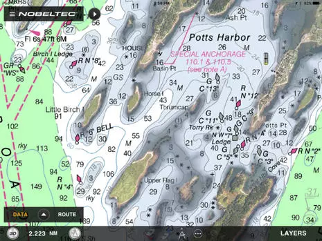
Now let’s review various charts a boat like Crystal Blues could fairly easily have at hand on a tablet or dedicated marine display these days. In U.S. waters, and many other places — but with Navionics SonarCharts very much excepted — almost all charts are based on the same official data. The fundamental soundings, nav aids, shorelines, shore features, etc. come from the same source, and so the differences involve display nuances, timeliness, and added features. For instance, I’m a big fan of TimeZero’s ability to mix well rendered NOAA raster charts with their PhotoFusion high resolution satellite photos that often improve visual guidance regarding shore features and sometimes even shallow water and mooring detail. Shown is a screen from the TimeZero TZ app (the Nobeltec and MaxSea brand names are slowly going away), but very similar chart imaging, plus a vector choice, is available with TZ PC software and on various Furuno NavNet displays.
However, TimeZero chart data tends to be dated, at least in part because it’s all reprocessed from the original sources so that it zooms, pans and even goes 3D quickly and smoothly. For instance, if you search the TimeZero Chart Catalog for current NOAA raster charts, you’ll see a MWRUSAMAP10.1Chart List PDF indicating that the last Revision Dates of the current batch are in late 2016 at best. The raster chart dates for other areas like the Caribbean are often even older, sometimes much older (and the 11.1 date list for TZ NOAA vectors doesn’t look good either).
But then again, the TimeZero app with all NOAA raster charts or a big area of Europe costs about $50, the equivalent of about two current NOAA print-on-demand paper charts. And the TZ vector charts sourced from C-Map that can be purchased for other TZ and Furuno charting engines all seem to have been refreshed last summer. Also, to my knowledge, only Navionics claims to be constantly updating the charts they make available for download, and Navionics is about the worst at documenting the sources and dates of the specific data sets behind their charts.
For more detail about data sourcing mysteries, please see my 2016 review of Cuba charts, and also note that no chart maker I know of is yet doing much with NOAA’s valuable Zones of Confidence (ZOC) initiative. The bottom line: Digital charts are relatively inexpensive, but it’s a good idea to have more than one set.
Here’s the Pott’s Harbor area as seen on a Garmin BlueChart, and I used the inset to show how I had to zoom in deeper before the 3.0 foot sounding that surprised Crystal Bluescame on screen. That’s not particularly peculiar to BlueCharts and, as noted earlier, it’s not uncommon in my experience for the algorithms that determine vector chart display to miss an important sounding altogether. On the other hand, Garmin’s bold shallow watercolors are a good visual hint at possible issues.
Note that I took this screen in September (when I started this entry), and now the BlueChart Mobile (BCM) app I used has been sadly discontinued. But then again, if you own a Garmin chart plotter made since 2012, the new ActiveCaptain app I reviewed can put its charts on your tablet or phone at no further cost
This is how I think Navionics SonarCharts should be used, side by side with the company’s regular navigation charts. So the underwater detail you see on the right is based on (NOAA’s) official hydrographic office data — though vintage and ZOC unknown — while the “extra detail” on left is derived from crowdsourced sonar logs and other sources completely unspecified but definitely not official. These charts are on a Navionics+ card that can be updated at any time during the first year of ownership and thereafter, if you renew your subscription. And the card is being displayed on a Raymarine eS Series MFD, though it will also work with MFDs made by Navico and others (maybe why it seems strange that Garmin now owns Navionics).
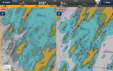
C-Map can offer even more chart types on a single card than Navionics. Their 4D Max+ bundle — seen on a Simrad NNS evo2 above, but also available for Raymarine MFDs — includes a raster chart layer sourced from hydro offices around the world as well as familiar C-Map vector charts, and C-Map “High Resolution Bathy Data” looks a lot like Navionics SonarCharts, though again source unknown plus no crowdsourced data added (yet).
But now that C-Map is a corporate sibling to Navico, the Genesis crowdsourcing technology has become C-Map Genesis, which may well become part of future C-Map cartography bundles. Perhaps also telling about the future of C-Map — which has just become the main chart choice besides Garmin/Navionics — is that they just acquired i-Sea, which has already developed Embark apps that seem to take a very modern approach to route and information sharing. Maybe we’ll see new C-Map apps with the advanced features I recently highlighted in Navionics Boating plus an able alternative to the ActiveCaptain crowdsourcing now also owned by Garmin?
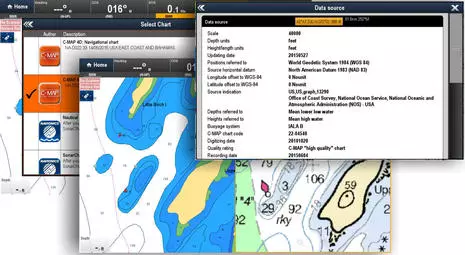
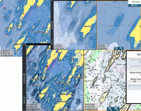
Here’s what C-Map 4D Max+ looks like on the Raymarine eS128 running Lighthouse 2, and it’s interesting to note that the new Lighthouse 3 currently running only on Axiom Series displays also learned to display C-Map recently. With Raymarine now the only major brand that doesn’t own its own chartmaking operation — TimeZero for Furuno uses some base data from other companies, but not their advanced features — one speculation is that C-Map and Garmin/Navionics will compete for their business. So that great screen of chart choices in the background above may be the future. Note, too, the source detail that C-Map has long been good about. And that overall it’s pretty easy to have multiple chart choices on your boat right now.