Line Types
Lines are drawn to describe objects, hidden conditions, and important relationships between components and space. A line drawn on a surface has both direction and weight. The weight of a line refers to its thickness and intensity; a line can also be continuous or dashed. The direction can be straight, curved, diagonal, or a combination of these. In drafting, continuous lines of various weights are used to represent objects and major elements such as structural walls and columns. Dotted lines are usually used to denote objects hidden from view. However, they can also be used to denote other things, such as a wheelchair turning radius or ceiling height changes on a floor plan. The following are the most commonly used line types
• Cutting lines: show major slices in a building or object.
• Object lines: show major outlines of building elements or objects.
• Hidden lines: indicate areas or objects not visible on the surface, or objects hidden behind others. They are also used to show objects above the cutting plane of a floor plan, such as wall cabinets, beams, arches, etc.
• Centerlines: locate the symmetrical center of objects such as windows, doors, beams, and walls.
• Dimension lines and extension lines: indicate the physical dimensions of objects. Dimensions are placed directly above the dimension line or inserted within it.
• Leaders: line extending from text and ending with an arrow, pointing to an object or place.
• Break lines: indicate where an object or area is not drawn in its entirety.
• Layout lines: are used in the preliminary blocking out of components and for lettering guidelines.
Line Weights and Their Uses
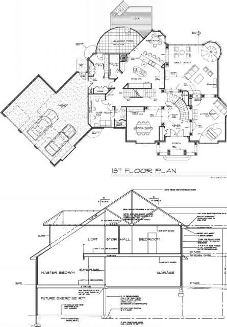
Line weight refers to the blackness (intensity) and width of a line on the drawing surface. In general, heavy (dark) lines are used to represent cutting planes and contours (or outer boundaries) of an object. In a floor-plan view, it is often the walls that are drawn with the darkest lines in order to define the spaces (Figure 3-8). These lines appear to be the closest to the viewer and are perceived as major elements. Medium and lighter lines appear to be farther away from the viewer and are used for secondary emphasis.
border line cutttngt plane line
object line
o z dimension i extension line
--"inbreak line
Figure 3-7 These are common line types used in drawings to describe objects, hidden conditions, and important relationships between components and space.
Drawings for interior design projects generally use three line widths: thick (dark), medium, and thin (light). Thick lines are generally twice as wide as thin lines, usually V32 inch or about 0.8 mm wide. Thin lines are approximately V« inch or 0.4 mm wide. Medium lines fall between these two extremes. In pencil drawings, each type can be further broken down, depending on the variety of lead and level of pressure. With the variety of mechanical pencils on the market today, it is easy to control line widths. As discussed in Chapter 2, fine-line mechanical pencils are available in a 0.3, 0.5, 0.7, or 0.9 mm lead. By switching to different pencils, the drafter can vary line weight easily.
Figure 3-8 In a floor plan, the walls are often drawn darkest to define the spaces. The viewer tends to see these lines first, and thus they are perceived as major elements.
Figure 3-9 Dark, thick lines are commonly used in building sections to denote where a plane is cut.

Figure 3-9 Dark, thick lines are commonly used in building sections to denote where a plane is cut.
BUILDING SECTION
Thick, Dark Lines
Thick, dark lines are used for major sections (Figure 3-9), details, borderlines, and cutting plane lines. A thick, intense line can represent the walls on a floor plan or structural members, such as fireplaces or stairways, the outline of a ceiling on a reflected ceiling plan, or the outline of a building on a site plan. Thick, intense lines are also used to emphasize an object or element.
Medium Lines
Medium-weight lines are used for hidden objects and are usually drawn dashed or dotted. They are also used for outlining the planes of objects and for centerlines, as well as for furniture and equipment. Thin, Light Lines
Thin, light lines are generally used as guidelines, drawn to help line up certain details or to help with lettering height. These lines should be barely visible and should disappear when a print or copy is made. Lines that are a little darker are used for dimension and extension lines, leaders, door swings, and break lines.